Our Graphic Designer’s 5 Favorite Myrtle Beach Golf Course Logos
By Joe Novak
 At PlayGolfMyrtleBeach.com, we dedicate our entire day—from sunrise to sunset—to providing you with the latest photos and videos showcasing the one-of-a-kind golf courses along our stretch of Carolinas coastline. But one aspect we often overlook is the standout branding that distinguishes them. As someone deeply involved in promoting these brands, I felt compelled to give a shout-out to the logos we encounter daily that I consider exceptionally well-designed.
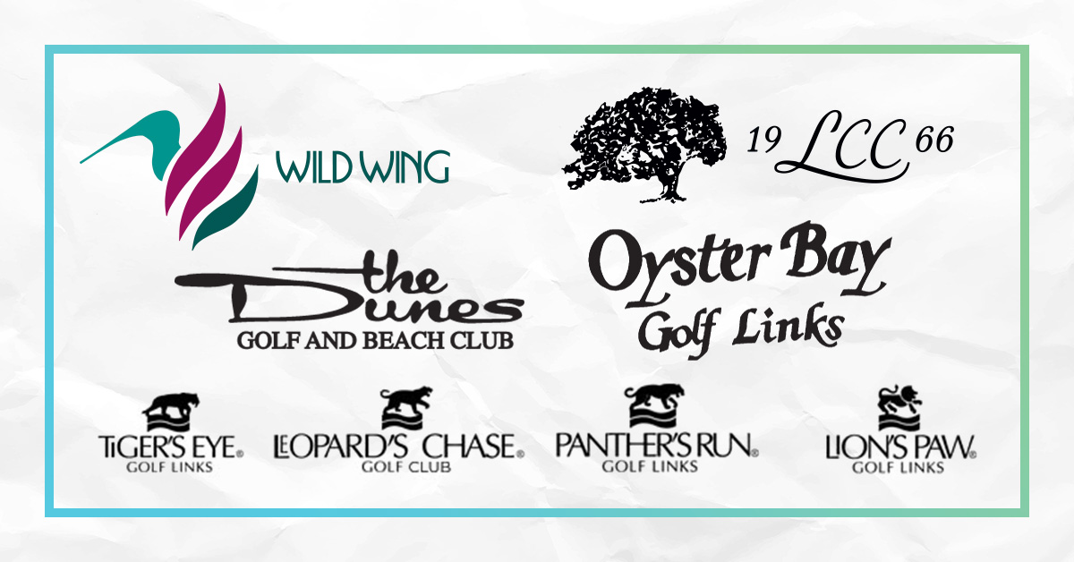
“The Big Cats” – Ocean Ridge Plantation boasts four courses, but their logos are all of the same piece. Tiger’s Eye, Leopard’s Chase, Panther’s Run, and Lion’s Paw all follow the same format: the silhouette of a big cat on top of the golf course name. But when you look closer, you’ll notice the typography in use is actually quite clever, using a typeface that I honestly wouldn’t ever want to have to work with due to the wildly variable character width and need to hand-space the lettering. Great care was taken to not only use things like the apostrophes cleverly, but also to create a unique space for the names themselves.
The Dunes Golf & Beach Club – Long before the PGA TOUR announced the upcoming Myrtle Beach Classic, The Dunes Club’s logos have reigned as the most iconic and recognizable in the area. From the club-crossed crest to the alligator to the unique choice of hand-drawn lettering, their branding both retains and exudes the prestige and reputation of this incredibly important part of Myrtle Beach history and legacy.
Wild Wing – This logo has a simple, clean, and modern design with a typeface to match it. Not only that, but the choice of color palette ensures that no matter where you’re seeing it, the branding is unmistakable and eye-catching. The sleek, stand-alone design of the bird also makes it incredibly versatile for merchandise, without having to always rely on the name or words to carry the brand.
Oyster Bay – Out of all the logos on this list, this one is probably the simplest, but one of the most iconic and impactful. It’s 100-percent text with no other adornments, and its slightly off-center and tilted characters are completely emblematic of the specific part of North Carolina where it sits. A little bit rustic, a little bit beachy, and with an air of class (but not stuffiness), you can almost picture the crushed shells and sandy soil that lines the entry without having to see it for yourself.
Litchfield Country Club – This logo made my list because it’s unlike any other I’ve seen in the area. Elegant, flowing, and makes a lot of really bold choices from a design perspective. The first time I saw it I remember thinking, “I never would have done it that way” – and that’s a good thing, because it’s much better that I didn’t. There’s absolutely no symmetry, and everything feels off-balance in a way that perfectly draws your eyes from center, to left, and all the way back again, giving off the exact Lowcountry vibes that the golf course itself embodies.
I think it’s quite evident that the excellence of these courses extends beyond the greens and fairways. Their thoughtfully crafted logos reflect their dedication and creativity behind the scenes. In celebrating these icons, we not only acknowledge their visual appeal but also recognize the brands that have become an integral part of our vacation golfing experience!